

The Ultimate PLG Analytics Dashboard (So Good Amplitude Adopted It)
Inside the PLG dashboard that became Amplitude's go-to template.

This deep dive comes from my good friend Ben Williams, the founder and writer of the Product-Led Geek.

When Amplitude adopted his analytics dashboard template, it validated what many of us already knew: Ben's frameworks for product-led growth aren't just theoretical—they deliver real results.
Let’s dig in!
If you run a SaaS business, you’d better understand clearly the nuances of how you monetise.
Today, I’m sharing an in-depth look at my go-to B2B monetisation analytics dashboard.
It's a template I developed for Amplitude and their new template library that significantly speeds up ramp-up time when getting started with analytics.
What’s really cool is that they’ve adopted this dashboard for their own use.
Talk about validation 😊
The Overall Structure of the Dashboard
Before we delve into the details, let's take a birds-eye view of the dashboard's organisation.
As I annotate in the dashboard:
This dashboard provides a comprehensive view of the monetisation funnel, from acquisition through conversion and revenue retention. It supports data-informed decisions on marketing spend, product development priorities and sales resource allocation. Regular review of these metrics can identify trends, opportunities and potential issues in the monetisation strategy.
It's divided into five key areas:
Business KPIs
Account Activation to Subscriber Conversion
Time to Paid Conversion by Acquisition Source
Churn by Acquisition Source
Monetisation Trigger Conversion
The sections are chapters in the story of a customer's journey, from their first interaction to becoming a loyal, paying user and potentially leaving. It's a narrative that helps us understand the entire customer lifecycle coherently.
Now let’s examine each section in detail.
Business KPIs: The Essential Metrics
At the top of our dashboard, we have our crucial Business KPIs. These figures help us understand the state of the business. They provide a clear view of overall business health and monetisation performance and highlight areas for deeper investigation.
Let's look at each one:
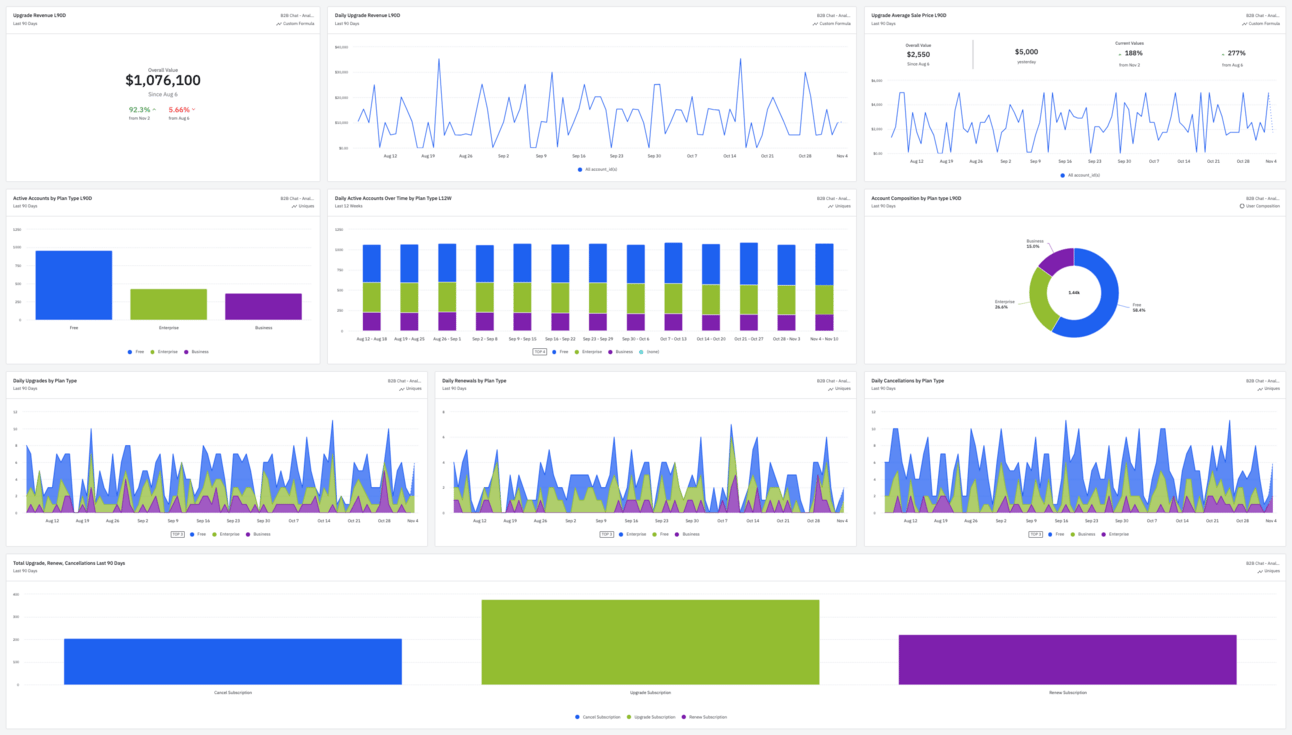
Financial
Upgrade Revenue L90D: This summary shows the total upgrade revenue for the last 90 days, with some historical trend data. Upgrades are any upward movement from any account tier (including free) to another, encompassing new and expansion revenue. Often the revenue split is particularly significant, and if so I’ll separate out new and expansion revenue in the top level of the dash.
Daily Upgrade Revenue L90D: This line graph displays daily upgrade revenue over the last 90 days. Fluctuations can help identify trends, peak days, seasonality, and factors influencing upgrade decisions. It allows us to identify unusual patterns that require further analysis into specific time periods, customer segments, or product changes, and ask “What happened there?”
Upgrade Average Sale Price L90D: This chart shows the average sale price for upgrades over the last 90 days. An upward trend indicates that the product evolution matches customers’ perception of increasing value. Anomalies in ASP would trigger analysis into specific customer cohorts or product/pricing changes.
Using Amplitude’s ‘Anomaly + Forecast’ feature would provide a clearer view of the trend for the charts.
In most situations, we want our daily upgrade revenue and ASP to trend upwards.
Account-Level Activity
Active Accounts by Plan: This bar chart shows the distribution of active accounts by plan type: Free, Enterprise, and Business.
Daily Active Accounts Over Time by Plan Type L12W: This stacked bar chart shows the daily active accounts over the last 12 weeks, segmented by plan type. It provides insight into mix shift across plan types over time, and absolute volume growth. This chart is valuable to product and growth leaders for understanding trends in active usage and detecting daily/weekly patterns. Anomalies in daily active usage (sudden increases or decreases) could indicate external factors (e.g., seasonality, marketing campaigns) or product changes, prompting deeper investigation.
Account Composition by Plan Type L90D: This pie chart illustrates the distribution of all accounts (not just active) across different plan types for the last 90 days, providing an overview of the customer base composition.
Your growth model determines your interpretation of these charts. In a freemium model relying on viral acquisition loops with free users, it would be unhealthy to have a low proportion of free accounts. You’d want increasing absolute volume and a healthy ratio that supports your growth model.
Monetisation Accounting
Daily Upgrades by Plan Type: This stacked area chart shows daily upgrades by plan type over the last 90 days. It complements the "Upgrade Revenue" chart by showing daily volumes, and helps identify the most popular plans for upgrades and any patterns. I use this to spot anomalies. Unexpected spikes or dips would trigger further analysis into product updates, pricing changes, offers, or customer success initiatives.
Daily Renewals by Plan Type: This chart focuses on renewals, like the upgrades chart. It provides insights into customer retention and loyalty across different plan types.
Daily Cancellations by Plan Type: This chart shows cancellations by plan type, crucial for understanding churn and spotting potential issues. I’ll often set up Amplitude triggers on this chart to detect churn trends and respond before they cut too deeply.
Total Upgrades, Renewals, Cancellations Last 90 Days:This bar chart compares the total number of upgrades, renewals, and cancellations over the last 90 days, showing overall customer movement and business health. It provides context for the more granular daily charts.
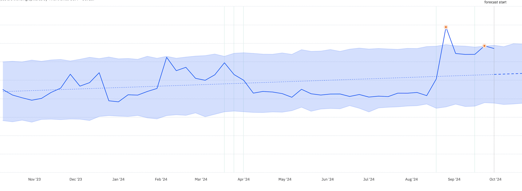
Another useful alternative to these charts is a growth accounting chart. You can create these in Amplitude for usage growth but not revenue yet (AFAIK).
Depending on your business and focus, consider including the following charts in your top-level summary:
Monthly Recurring Revenue (MRR): Shows the business's consistent income. MRR isn't just a number – in a PLG business it reflects the value we provide to our customers. It's a lagging indicator moved sustainably by providing real value to users and their teams.
Logo Churn: This metric reflects customer satisfaction and how well our product meets ongoing needs. We aim for a decreasing trend.
Net Revenue Retention (NRR): The ultimate lagging indicator of how well we serve our current user base.
Qualified Pipeline: This metric indicates potential future revenue and is relevant for businesses with longer sales processes.
Having these metrics side-by-side allows us to spot correlations. For instance, does an increase in Qualified Pipeline lead to MRR growth months later? These insights can inform strategic decisions.
Notes:
Tracking metrics over the last 90 days balances recent performance and longer-term trends.
The mix of revenue, pricing, and account-type metrics offers a comprehensive view of monetisation.
Daily active accounts by plan type over 12 weeks (L12W) allows you identify weekly patterns and trends in plan mix shift.
Tracking upgrades, renewals, and cancellations separately provides insights into customer lifecycle movements.
Account Activation to Subscriber Conversion (The Path to Paid Use)
This section shows how effectively we guide users from account activation to becoming paying subscribers.
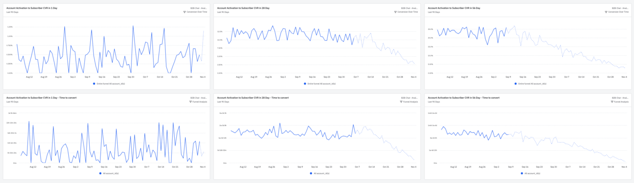
What we’re showing:
Account Activation to Subscriber Conversion Rate (in 1, 28, 56 days): These charts show overall conversion rate trends, but cohort analysis is necessary for deeper understanding. They’re good at revealing the impact of activation criteria or onboarding changes, ahead of lagging retention impact.
Account Activation to Subscriber Conversion Rate - Time to Convert (in 1, 28, 56 days): These charts show the time to convert for activated accounts in different time windows. They are useful to identify opportunities to accelerate conversion through sales/marketing automation or product mechanisms. Anomalies like unexpected changes to average or extreme values warrant investigation. Look at trends across all three periods and ask about the reasons behind those trends. A trending decline in a shorter period (e.g. < 1 day conversions) might not be bad if overall conversions (and retention) are rising.
Depending on the context, I’ll add charts that are not included in this specific dashboard:
Activation Rate: This is the primary lever for improving retention and monetisation in a product-led business. A high activation rate indicates we’re successfully guiding users to experience the core value of our product and leading them to habitual usage.
PQA to Subscriber Rate: Product Qualified Accounts (PQAs) are existing or prospective customers within your Ideal Customer Profile (ICP) who meet objective scoring criteria indicating that sales involvement would help monetise. This metric shows how well we're converting these highly qualified leads into paying customers. (See here for a deep dive PLGeek Guide to PQAs). Improvements in activation rate often precede increases in the PQA to Subscriber rate. This underscores the importance of a well-designed activation process.
Overall Time to Convert: This chart shows the speed at which accounts move through our funnel from first usage to becoming paying customers.
Free to Paid Conversion Rate by Acquisition Source (Assessing Top-of-Funnel Quality)
This section combines two critical growth aspects: acquisition and conversion. We're examining conversion rates for different acquisition sources and the speed at which leads from each source convert.
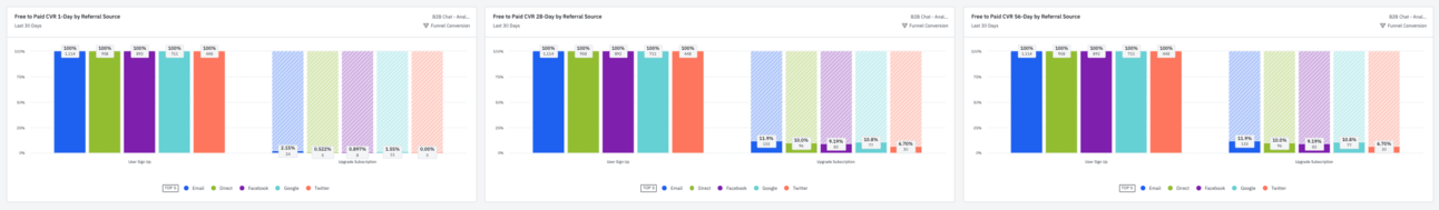
Free to Paid Conversion Rate by Referral Source (in 1, 28, 56 days): These charts show which acquisition channels bring in users most likely to convert to paid. Anomalies in individual channels require further investigation.
Sometimes, I’ll set these up as trend graphs or alerts.
The insights here can significantly influence your marketing strategy. You might find that leads from content marketing take longer to convert but have higher long-term value, while those from paid advertising convert quickly but churn faster.
Cross-reference this data with your customer acquisition costs/payback and lifetime value metrics to understand which channels drive sustainable growth.
Churn by Acquisition Source (Retention Importance)
In B2B SaaS, customer retention is as crucial as acquisition. It’s the cornerstone of sustainable growth.
This section helps us identify acquisition sources that bring in long-term customers.
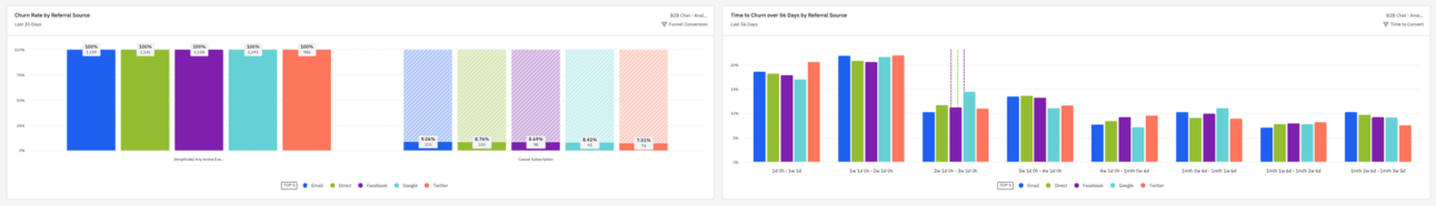
We have:
Churn Rate by Referral Source: This chart highlights acquisition sources with higher or lower churn rates, informing deeper dives into churn reasons and customer behaviour.
Time to Churn over 56 Days by Referral Source: This chart shows the time to churn distribution for different user acquisition sources. Useful for identifying anomalies and typical churn periods for targeted intervention strategies.
Here's what to look for:
Churn rates over time for each acquisition source
Churn rate patterns (such as seasonal effects)
Is there a correlation between quick conversions and high churn rates?
Watch for sources with high conversion and churn rates. This typically indicates overselling - a mismatch between our messaging/campaigns and the product’s value.
Low churn isn't just about maintaining revenue. It's a sign we're delivering genuine value to our customers.
Monetisation Trigger Conversion (Understanding Upgrade Drivers)
This final section examines actions or triggers that lead to upgrades or increased spend.
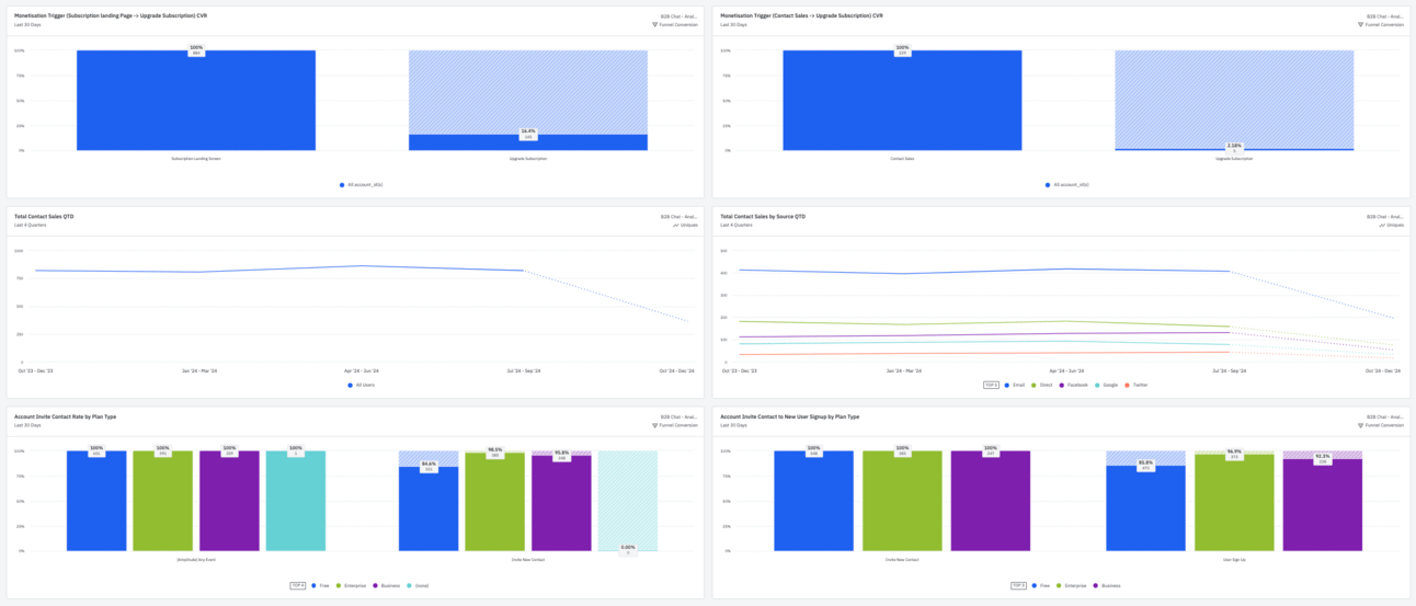
Some examples:
Using a specific feature
Reaching a usage limit
Inviting team members
Integrating with other tools
A specific in-app CTA
Identify the actions that correlate with monetisation. Once you've pinpointed these triggers, refine your product and onboarding process to encourage these behaviours.
For example, you might consider highlighting the integration process during onboarding if users who integrate your tool with Slack are more likely to upgrade.
The charts in this section should be backed by specific data relevant to your product. In the example:
Monetisation Trigger (Subscription landing Page/Contact Sales -> Upgrade Subscription) CVR: These charts show conversion rates for specific monetisation triggers. In this case, the CTAs on the subscription landing page and the contact sales page, to compare the performance of these monetisation paths.
Total Contact Sales: Overall sales contact trends are shown here. Anomalies would prompt deeper analysis into sales/marketing performance or seasonality. I’ll often present this as a % of active accounts.
Total Contact Sales by Source QTD: This breakdown of contact sales volume by source complements the "Contact Sales" chart by identifying channels with unusually high or low sales engagement.
Account Invite Contact Rate by Plan Type: This chart shows how accounts in different plans behave around inviting peers. It’s a measure of natural virality and how our features in each plan support the necessary collaborative use-cases.
Account Invite Contact to New User Signup by Plan Type:This is the natural partner to the previous chart, providing a high-level view of invite effectiveness by plan type.
Geek Note: Combining metrics enhances insights. For example, high contact sales from a specific acquisition source and low conversion rates could reveal a channel bringing in low-quality leads. Similarly, combining upgrade and churn data with active account distribution can provide insights into plan/pricing optimisation. These relationships guide further analysis and unlock growth opportunities.
The Broader Perspective on B2B Monetisation
Now that we've examined each dashboard section, let's step back and consider the bigger picture. This dashboard is a tool for awareness, alignment, and informed decision making. Here's how to use it effectively:
Identify your monetisation critical paths. Use the 'Account Activation to Subscriber Conversion' and 'Monetisation Trigger Conversion' sections to understand actions and behaviours leading to paid conversions.
Refine your acquisition strategy. The 'Time to Paid Conversion by Acquisition Source' section can help you allocate your marketing budget more judiciously.
Enhance retention. Use the 'Churn by Acquisition Source' data to focus on acquiring customers likely to stay long-term.
Monitor the impact of product changes. Observe the effects on activation and conversion metrics when introducing new features or adjusting your onboarding process.
Forecast growth. Understanding your conversion and churn rates helps predict future revenue.
The goal isn't to amass data. It's to transform it into actionable insights that drive growth.
Getting Started
If you want to implement this dashboard in your business, go ahead and use the Amplitude template to instantiate it in your project.
Don’t forget to
Invest in trustworthy instrumentation (make sure you have account-level perspective).
Build your own version around your growth model. Know the key levers you need to monitor.
Establish baselines. Before optimising, understand your current metrics.
Set goals and bounds. Where appropriate, set targets and constraints (i.e. the limits of a metric indicating anomalies that warrant a thorough investigation).
Review regularly. Make this dashboard central to your leadership and growth team's discussions and decision-making.
If you have thoughts or questions about this dashboard or want to share your experiences with similar analytics tools, please get in touch. I'm always keen to learn from your wisdom.
That's all for now, folks! Go follow Ben on LinkedIn and subscribe to his newsletter, The Product-Led Geek.
And, of course, if you didn’t know. I’m writing a book all about crushing early-stage churn. EUREKA: The Product Onboarding Playbook for B2B Companies tackles one of the most important parts of the customer journey—the onboarding experience.
I share frameworks for creating unified messaging that drives successful onboarding across every customer segment.
Pre-orders are now open. Early birds can access templates, draft chapters, and my private onboarding community. 🎉
