

3 Behavioral Models to Design Habit-Forming Onboarding Experiences
Annoyed by popups? Kate Syuma explores BJ Fogg, CREATE, and The Hook models applied to B2B and B2C products.
This post is written by Kate Syuma , the founder and creator of Growthmates with Kate Syuma and a leading expert at the intersection of Product-led Growth and User Experience. As former Head of Growth Design at Miro, she built and led a team of over 10 designers while pioneering behavior-driven approaches to user engagement.

Through Growthmates, her advisory practice and podcast, she now shares insights with growth leaders from companies like Dropbox, Pinterest, Adobe, and Atlassian.
In her new course, User-centric Product-led Growth, she teaches how you can master PLG from onboarding, habit-forming, to monetization with proven growth practices in 3 weeks and turn it into a Growth Roadmap. The next cohort starts on 16th June, and with a promo “RAMLI”, you can enroll with 120$ off.
In this post, she reveals three powerful behavioral methods for creating engaging product experiences that naturally drive user adoption.
What we cover in this post:
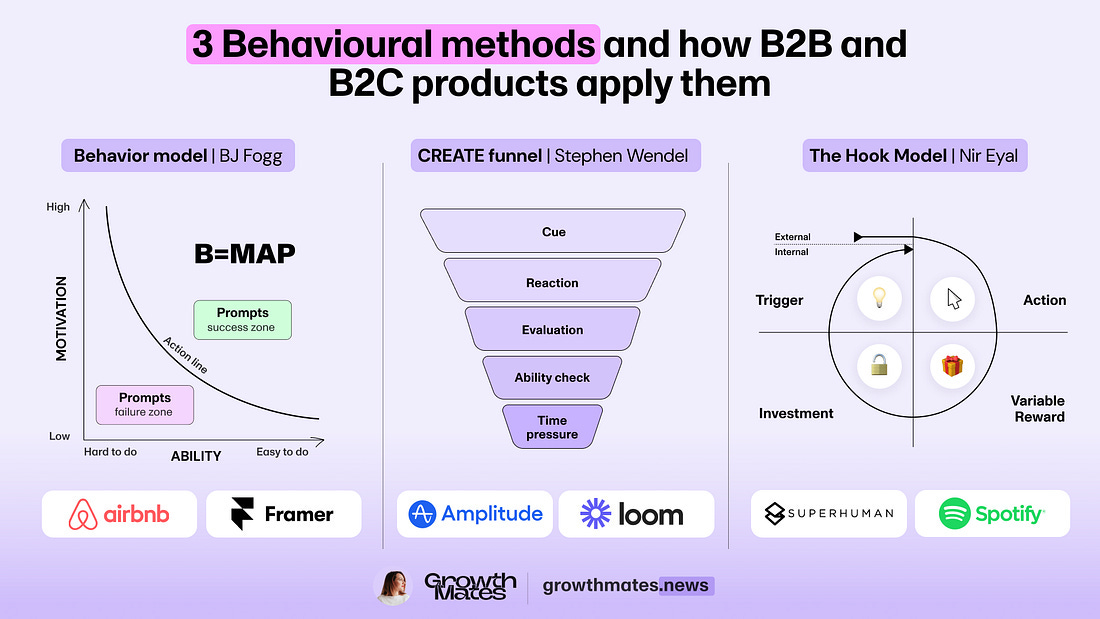
BJ Fogg's Behavior Model: Aligning motivation, ability and triggers
CREATE Action Funnel: Understanding the psychology of user decisions
Hooked Model: Building ethical habit-forming experiences
Let's dive into each method 👇
Everyone is annoyed by popups, and popups are still everywhere.
Why are products still using them? Because it’s the most common pattern, and there’s no handy alternative in place. But here’s the problem that traditional popups are causing:
Blindness: you got so familiar with that, so you simply skip them and close immediately 🤯.
Interruption: if they appear while you’re doing something important, your annoyance goes to the next level 🤯🤯.
Irrelevance: if the time and placement of these popups are wrong again and again, you’ll probably never return to the product again 🤯🤯🤯.
We definitely want to avoid that, and for that, we need to avoid making popups our go-to solution. To design an engaging user experience, we need to uncover real motivations and use alternative tools. I can assure you — there are plenty of them.
Today, we’ll dive into alternative methods and examples of how you could use them. In this story, expect examples from Amplitude, Spotify, Superhuman, and other B2B and B2C products.
While I was at Miro, I introduced one principle we used with the design team in Growth. Think big, start small, iterate smart. This principle also helped to treat the “overlapping popups” situation differently. When on design reviews I saw that this pattern could emerge, I kindly asked my team:
Let’s imagine that popups just don’t exist in our product and design system. How might we (HMW) solve this problem by using an alternative solution and method, and highligt the value we want to deliver to end user?
It opened my eyes to 3 things that must be done right if we want to engage users with the triggers and messages we show to them:
Right Time: users are not interrupted in the middle of important tasks. It appears with the right natural frequency that the product should be used.
Right Place: it’s not shown in unexpected or irrelevant locations.
Right Value: the content inside that message delivers value to the user
Before the actual appearance (e.g. popup, tooltip, checklist) we need to think about the logic that will deliver the value and motivate an action. For that, we need to look back at the fundamental methods of behavioral science.
I’ve been combining “User” and “Business” thinking my whole career — since my 6 years at Miro advising 15+ SaaS companies. Every company I’ve worked with has shown me ONE thing: User experience is the ultimate growth lever.
Now, let’s finally dive into each of 3 behavioral methods 👇
Method 1. BJ Fogg Behavior Model
Behavioral science has been shaping how we design products for decades, and one of the most influential frameworks comes from BJ Fogg, a researcher at Stanford University. He’s spent years studying how tiny shifts in design and psychology can drive big changes in human behavior. His Behavior Model, introduced in the early 2000s, explains why people take action and why they don’t.
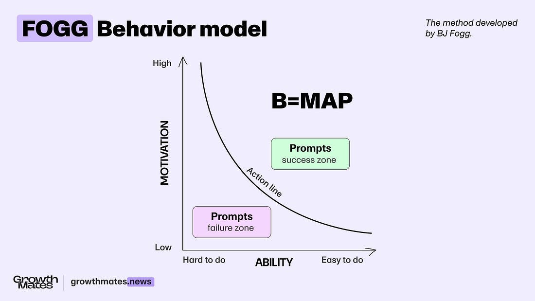
According to Fogg, for someone to take action, three things need to align at the same time:
Motivation — Do your users actually want to do it?
Ability — Can they do it easily without too much effort?
Prompt — Is there something triggering them right nowto act?
If any of these are missing, the action won’t happen.
Too hard? No action.
No motivation? No action.
Not relevant prompt? No action.
B = MAP
Behavior (B) happens when Motivation (M), Ability (A), and a Prompt (P) all align at the same time.
BJ Fogg — Behavior model.
Think about it like this: You want to exercise (motivation), and you have a gym nearby (ability), but if no one reminds you or you don’t set a plan (prompt), it won’t happen.
Or the other way around: You get a push notification (prompt), but if the app requires too many steps (low ability) or you don’t see the value (low motivation), you’ll ignore it.
This is why great products don’t just remind users — they make actions effortless and rewarding. Instead of forcing behaviors, they lower friction and align with what people already want to do.
Want users to take action? Don’t push hard. Make it easier, more motivating, and well-timed.
On the Growthmates podcast, I had the privilege to talk Chief Behavioral Officer and author of the book “Engaged” — check it out 👇
Driving a Positive Behavioural Change with Your Product | Amy Bucher (Lirio, Author of "Engaged")
Now, getting back to the topic. Let’s explore some examples of how BJ Fogg's Behavior model applied to some of my favorite SaaS products.
👍 Example: Framer — Contextual AI suggestions.
Many products are now introducing AI features. Some are trying to encourage adoption by bombarding users with popups, triggers, and notifications.
Instead, we need to introduce new behaviors inside existing workflows carefully. Framer is contextually showing the prompt while users edit the text inside the website builder. They are not interrupting the natural workflow. If we
Framer — contextual AI suggestions.
If we apply the BJ Fogg method, it would look like this:
Motivation — I want to create a high-quality landing page fast.
Ability — I want to easily edit the text and components without too much context switching.
Prompt — I see a “sparkling” icon and am curious to explore. The quick actions I see there are quite relevant (Rewrite text, Create component).
By introducing these contextual prompts at the right time and place, we can smoothly guide users through a new experience and adopt new patterns, like AI features adoption.
📌 For 10+ more product flows for AI adoption from Airtable, Canva, Loom, and more — Check out the free board →
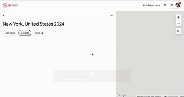
👍 Example: Airbnb — Prompt to share a wishlist.
Let’s get back to popups, and let me say something controversial. The fact that they became annoying is not because the method itself is bad. It’s because too many companies have overused them NOT in the right place and NOT at the right time.
But there’s a way to use them as a prompt, delivering value and adopting new user behaviors when it’s relevant. Look at this example from Airbnb — they show new users that they can share a wishlist right after the creation. After closing the popup, they show contextually how to get back to sharing functionality.
Motivation — HIGH, I just created a wishlist.
Ability — EASY, Airbnb gives 1 relevant action / CTA to share.
Prompt — RELEVANT, I either use it now, or I know how to get back to sharing later when I’m ready.
These patterns shouldn't be overused. If you use a popup, use it carefully — make sure it appears only when the motivation is at a high level and in a relevant context. Don’t overuse these reminders over and over — set a clear limit, and ideally, show it only once for education and feature discoverability purposes. We don’t want to annoy our users 😉
📌 Get 25 growth flows from Canva, Linear, Notion, and more — Check out the free board →
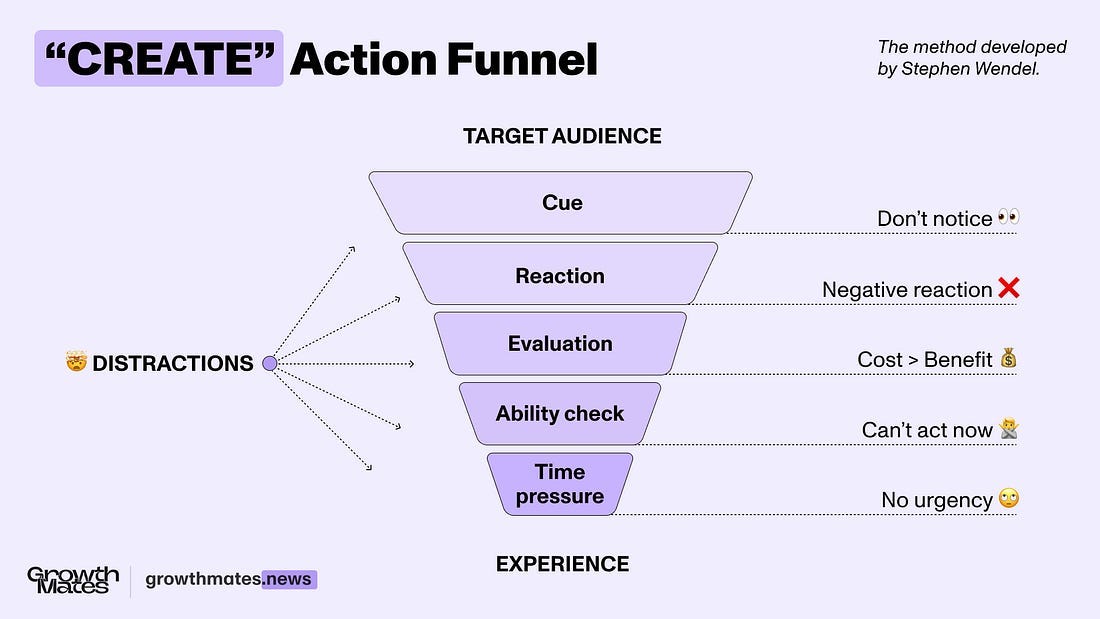
Method 2. CREATE Action Funnel (Stephen Wendel)
People don’t just take action randomly — there’s a process happening in their minds before they do anything. And if something feels off at any step, they drop off. That’s where Stephen Wendel’s CREATE Action Funnel comes in.
It breaks down what needs to happen before someone actually follows through:
(C) Cue — Something reminds them to act.
(R) Reaction — Their gut feeling kicks in. Do they trust it or not?
(E) Evaluation — They think it over. Is this worth it?
(A) Ability — Can they actually do it? Do they have what they need?
(T) Timing — Does it feel urgent, or can it wait?
(E) Experience — Have they had a bad time with this before?
❌ Dark pattern: Interrupting instead of guiding through a natural flow.
Each step is a potential drop-off point. If the cue isn’t strong enough, they won’t even notice. If it feels weird or untrustworthy, they won’t bother. If it’s too hard, badly timed, or reminds them of a past bad experience — it's game over.
This is exactly why popups fail. They interrupt instead of guiding people through a natural flow. They ignore timing, appearing when users are busy. They demand action without making the benefits clear. And worst of all? Bad past experiences make people close them instantly.
So, how can we avoid that?
💚 Good pattern: Respect natural behavior and guide through it.
Instead of forcing attention, we need to work with how people actually make decisions. That means:
Making sure cues are natural, not disruptive.
Keeping actions intuitive and effortless.
Showing clear value, so people actually want to engage.
Timing interactions when users are ready, not when it’s easy for to show as a business.
👍 Example: Amplitude — Guides & Surveys.
I’ve been on the lookout for great examples of thoughtful user guidance, which, let’s be honest, isn’t easy to find. But recently, I came across something interesting that Amplitude recently introduced.
Instead of throwing popups at every user, Amplidude’s Guides and Surveys send the right message at the right time. If you’re exploring a new feature, it doesn’t jump in immediately — it nudges you only when needed. If feedback is requested, it happens right after a meaningful action, not in the middle of something important.
Just check out how it works — magic! 👇
What I like the most: this isn’t just about better targeting — it’s about respecting the user experience:
Messages appear when they’re actually useful, not disruptive.
It avoids message fatigue by knowing when to stay silent.
It adapts — sometimes it’s a tooltip, sometimes a full guide.
It even detects frustration — if users keep rage-closing popups, that’s a sign of rethinking timing.
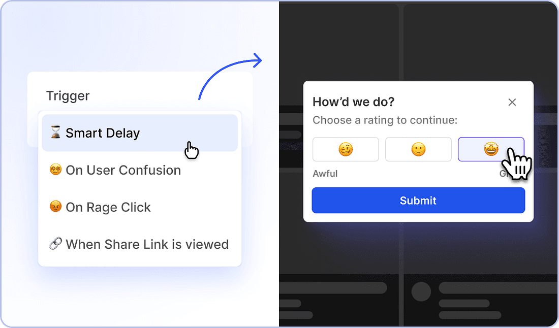
This kind of approach makes a difference. Instead of forcing engagement, it lets users discover at their own pace — which is how great product experiences should feel.
👍 Example: Loom and Wise — Invitation triggers and rewards.
Instead of interrupting users with popups that will be immediately closed, make it easier to access your valuable experience when it’s the right time for them.
For example, both Loom and Wise placed referral bonuses for invitations as a separate menu item. Loom is also reminding users to invite teammates contextually inside the Library, while Wise chooses a “wise” strategy for that — showing a referral trigger after the user sends or receives money (= experience the core value of the product).
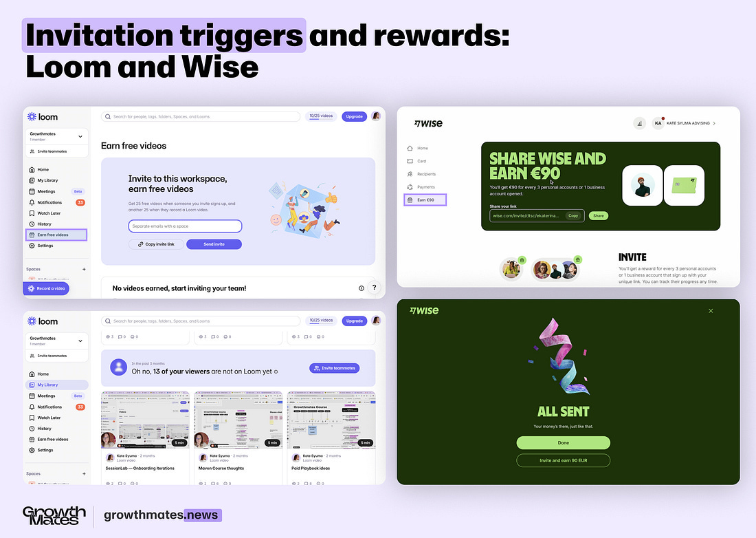
Loom and Wise — Examples of referral triggers.
Let’s break it down with the CREATE framework:
(C) Cue — section “Earn” on the homepage reminds me to invite for a bonus.
(R) Reaction — it’s not interrupting a workflow, so I can come back later.
(E) Evaluation — there’s an explanation of tangible value (25 videos or 90 EUR).
(A) Ability — it’s easy to invite (copy the link or paste the email right there).
(T) Timing — there are no time constraints, while in Wise, it might be a bit urgent as if I close the window and if it’s the first time I saw it,I don’t know how to return.
(E) Experience — in both platforms, I have had a good experience so far, so I’m ready to invite others. I trust they will deliver on their promise.
Referral strategies in B2B can be quite complex and different — learn more about them in my recent post here 👇
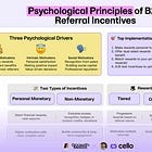
7 Psychological Drivers of Referral Behavior to Accelerate B2B Growth
Method 3. Hooked Model (by Nir Eyal)
Getting back to behavioral methods — which one is most well-known? Of course, The Hooked Model by Nir Eyal. It explains how products create habit loops that keep users coming back ethically.
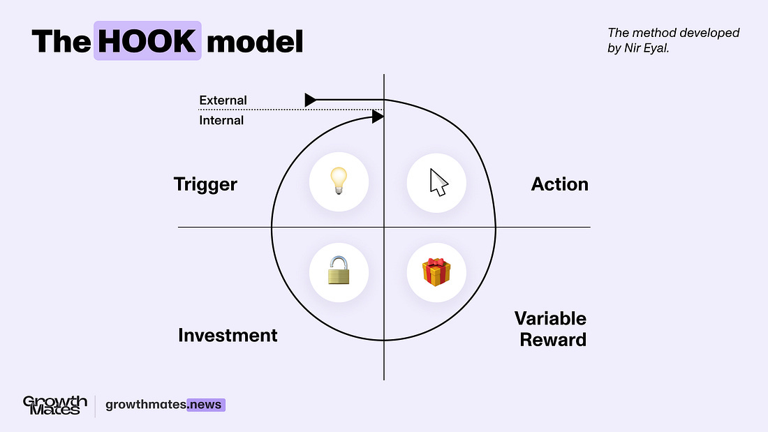
The model breaks down into 4 key steps:
Trigger — Something prompts the user to take action. This could be external (a notification) or internal (a feeling like boredom or curiosity).
Action — The simplest behavior a user can take in anticipation of a reward (e.g., opening an app, scrolling a feed).
Reward — The dopamine hit that keeps users engaged—variable and unpredictable rewards work best (e.g., new content, social validation).
Investment — The user puts something in (time, data, effort), making it more likely they’ll return (e.g., following people, saving preferences).
The best habit-forming products don’t just demand attention — they create experiences that feel natural, rewarding, and worth returning to.
Let’s look at a couple of examples from the real world
👍 Example: Spotify — Discover Weekly.
I’ve been using Spotify’s Discover Weekly for over three years, and every Monday, I find myself coming back to see what’s new. It’s not because of notifications or popups — it’s because the experience is designed to feel natural, rewarding, and worth my time. (Spoiler: I’m a huge fan of electronic music).
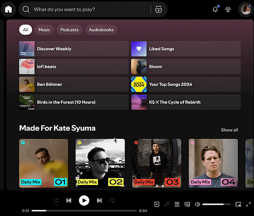
Spotify — Discover Weekly Experience.
This is a perfect example of Nir Eyal’s Hooked Model in action. Let’s break it down:
Trigger — Every Monday, a fresh “Discover Weekly” playlist appears in my library. There are no disruptive alerts, just a familiar section in a place I have already visited.
Action — Clicking play is effortless. The playlist is right there, requiring no extra steps to start listening.
Reward — The moment that keeps me coming back: a mix of familiar and new songs, tailored to my taste. The unpredictability of what I’ll discover next makes it engaging.
Investment — If I like a song, I save it, add it to a playlist, or follow the artist. This signals to Spotify what I enjoy, making future recommendations even better and strengthening the habit.
It’s designed to feel like a personalized, well-timed experience that fits seamlessly into my routine. And that’s what makes it a habit.
👍 Example: Superhuman — Inbox Zero.
I keep hearing from my network about Superhuman — people keep saying that it’s not just another email app but a completely different way to handle email. Instead of letting your inbox pile up, you’re reaching an “Inbox Zero” state.
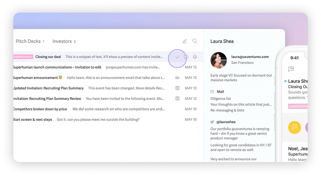
Superhuman — Email manager.
I think the secret to it is speed and focus on making an action — replying, archiving, or snoozing is possible with quick actions (like this check ✔️ button) and shortcuts. Clearing your inbox feels satisfying.
This is exactly how habits form: an internal trigger (an overflowing inbox), a quick action (shortcuts), an instant reward(a clean, calming screen), and an investment (learning the workflow, making it even easier next time). I also talked to Gaurav Vohra on one of my previous editions about how they increased week 1 activation by 17% at Superhuman. Check that story →
⭐️ Takeaways
Use prompts when motivation is high (BJ Fogg’s Behavior Model)Triggers work best when users are already engaged, not when they are distracted.Try this: Introduce feature prompts after a meaningful action — like Airbnb suggesting wishlist sharing immediately after creation.
Replace popups with contextual cues (CREATE Action Funnel)Guide users at the right time, in the right place, with clear value.Try this: Use tooltips, inline nudges, or action-driven suggestions — like Amplitude Guides and Surveys →
Make rewards meaningful and unpredictable (Hooked Model)People return when they anticipate value, but predictable rewards lose impact.Try this: Design dynamic, personalized experiences — like Spotify’s Discover Weekly, which delivers fresh music every Monday.
Enjoyed this post? Subscribe to my newsletter for bi-weekly insights on product-led growth, UX, and behavioral psychologlinky. Join 5,000+ growth leaders from companies like Grammarly, Intercom, Wistia, and Mentimeter.
Subscribe to Kate's Newsletter →
Every two weeks, I share actionable insights and real examples from top tech companies to help you create better user experiences and drive meaningful product growth.
That's all for now, folks! Go follow Ben on LinkedIn and subscribe to his newsletter, The Product-Led Geek.
And, of course, if you didn’t know. I’m writing a book all about crushing early-stage churn. EUREKA: The Product Onboarding Playbook for B2B Companies tackles one of the most important parts of the customer journey—the onboarding experience.
I share frameworks for creating unified messaging that drives successful onboarding across every customer segment.
Pre-orders are now open. Early birds can access templates, draft chapters, and my private onboarding community. 🎉

Thanks for sharing my story with your community, Ramli 🙌 Behavioural methods = my passion 🔥
Thank you for sharing this ☺️ behavioural design is a passion of mine